In Europe, minimalist beverage packaging has evolved from a design trend into a crucial strategic tool for premium and export-focused brands. For 2026, the focus is on packaging that instantly communicates clarity, sustainability, and authenticity. For beverage exporters targeting modern retail and specialty channels, a minimalist approach is now directly linked to perceived product quality and commercial viability.
The Rise of "Clean Premium" Aesthetics
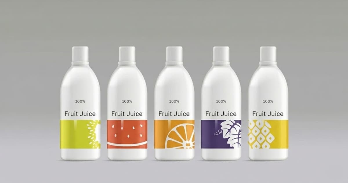
European consumers are wary of overly complex or "loud" packaging. Trust is built through clarity: clean typography, a muted color palette, and an uncluttered layout. Generous white space is no longer empty; it is a premium design element that signals confidence. It tells the buyer that the product inside is high-quality and doesn't need excessive marketing flair to prove its worth. This approach is particularly effective for categories like Aloe Vera Drinks, Fruit Juices, plant-based milks, and functional beverages, where a natural and trustworthy image is paramount.
Designing for Shelf Impact and Buyer Appeal
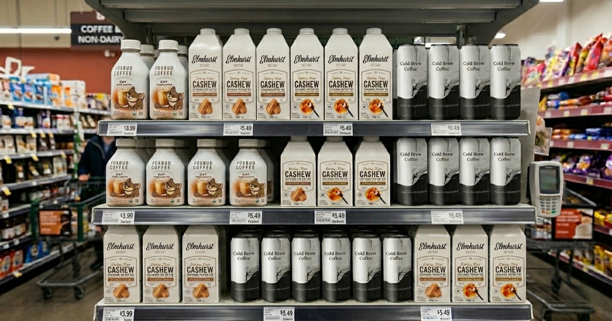
European retail buyers prioritize shelf impact. They assess how a product looks when stocked in multiples. Minimalist designs that are clean, bold, and instantly recognizable from a distance consistently perform better in competitive retail settings. Effective designs for 2026 feature a strong, clear product name, a single dominant color, and a simple icon or illustration—such as a piece of fruit—to communicate the flavor or core ingredient instantly. This strategy is vital for export brands aiming to secure listings in major European markets like Germany, the Netherlands, France, and Scandinavia, where shelf space is highly competitive.
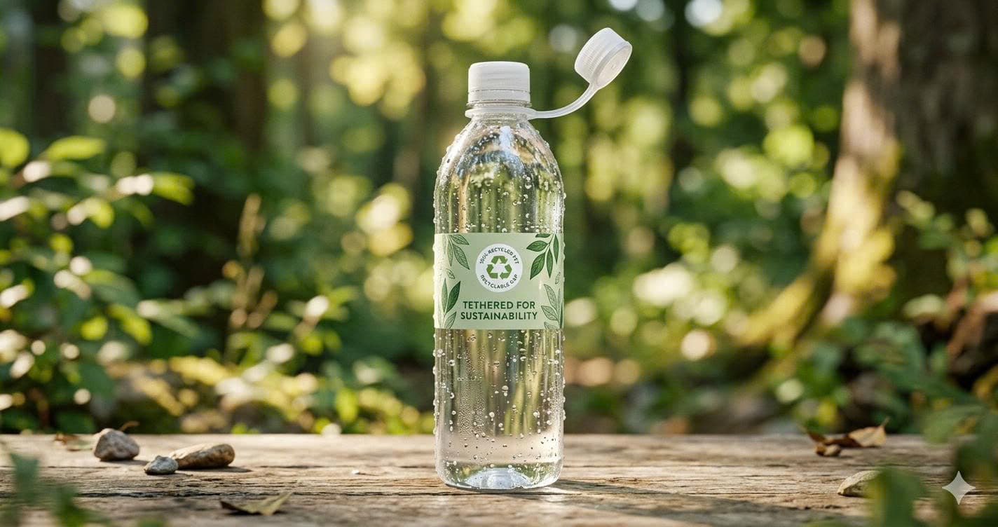
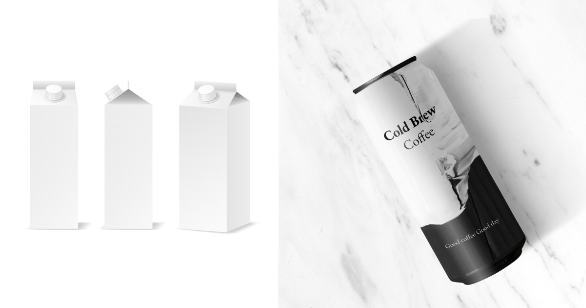
Minimalism as a Signal of Sustainability
In the European market, minimalism is increasingly synonymous with environmental responsibility. A simple design implies a more conscious use of resources. This perception is reinforced by tangible choices:
- Lightweight glass or PET bottles
- Labels made from recycled materials
- Reduced ink coverage
- Uncoated, natural-feel paper stocks
Brands are successfully balancing a premium aesthetic with sustainability by using clear PET bottles with minimal labeling or matte-finish aluminum cans with sparse graphics. This combination is key to being perceived as both modern and responsible in 2026.
Ultimately, for beverage exporters, adopting minimalist packaging is not about doing less; it's about communicating value more efficiently. A clean, confident design acts as a visual guarantee of product quality, manufacturing professionalism, and readiness for the global market, helping buyers make faster, more confident decisions.
Q&A
1. Why is minimalist packaging considered premium in Europe?
Minimalist packaging is seen as premium because it signals confidence and transparency. In a crowded market, simplicity cuts through the noise. European consumers associate clean designs with higher-quality ingredients, honest branding, and a focus on the product itself rather than on marketing hype.
2. What colors work best for minimalist beverage packaging in 2026?
For 2026, the most effective minimalist palettes feature earthy and neutral tones. Think off-white, light grey, soft beige, and muted greens or pastels. These colors create a natural, premium feel. A single, carefully chosen accent color can then be used to highlight the flavor or product variant, ensuring shelf differentiation without sacrificing the clean aesthetic.
3. Does minimalist packaging work for export brands?
Yes, it is exceptionally effective for export brands. Minimalist design transcends language and cultural barriers. Its clear, universal visual language allows international buyers and consumers to quickly understand the product's nature, quality, and premium positioning. It signals that a brand is modern, globally aware, and ready for sophisticated markets.